Reposition the university college as a multidisciplinary institution and drive course enquiries
A website redesign for a local university college to emphasise its diverse range of courses, shifting the focus from primarily design-related programmes.
My role
•
Conducted a usability audit to determine areas of improvement.
•
Designed mobile responsive wireframes and mockups to improve the user experience.
The challenge
With the university college's website being outdated, the management wanted to rebrand it as a broader learning institution instead of focusing primarily on design programs.
Identifying the reason for high user dropoff rates
A usability audit was conducted to determine the pain points of the website, pinpointing elements that deviated from standard UX practices and contributed to user frustration.

Findings
Based on user feedback and common design practices, the visual and user experience issues found could be broadly grouped into three categories.
There is no primary call to action, which does not visually direct the user on how to proceed.
The navigation structure was deeply nested, which would prevent first time users from finding specific content.
Content heavy pages with an unclear visual hierarchy would cause a cognitive overload to the user.
Goals
Several goals were created as a guide to measure the success of the redesign exercise.
Improve user retention rates through consistent design.
Simplify information architecture and reduced cognitive load for a more intuitive navigation.
Clear guidance on the user flow to increase conversion rates.
Creating the user personas
The pain points and goals were integrated to develop user personas, which represented the target users and guide the design process.


Understanding the user journey
User journey maps were created for each persona to highlight the highs and lows the users' encounter along the way to achieve their goal.

Outlining the user flow
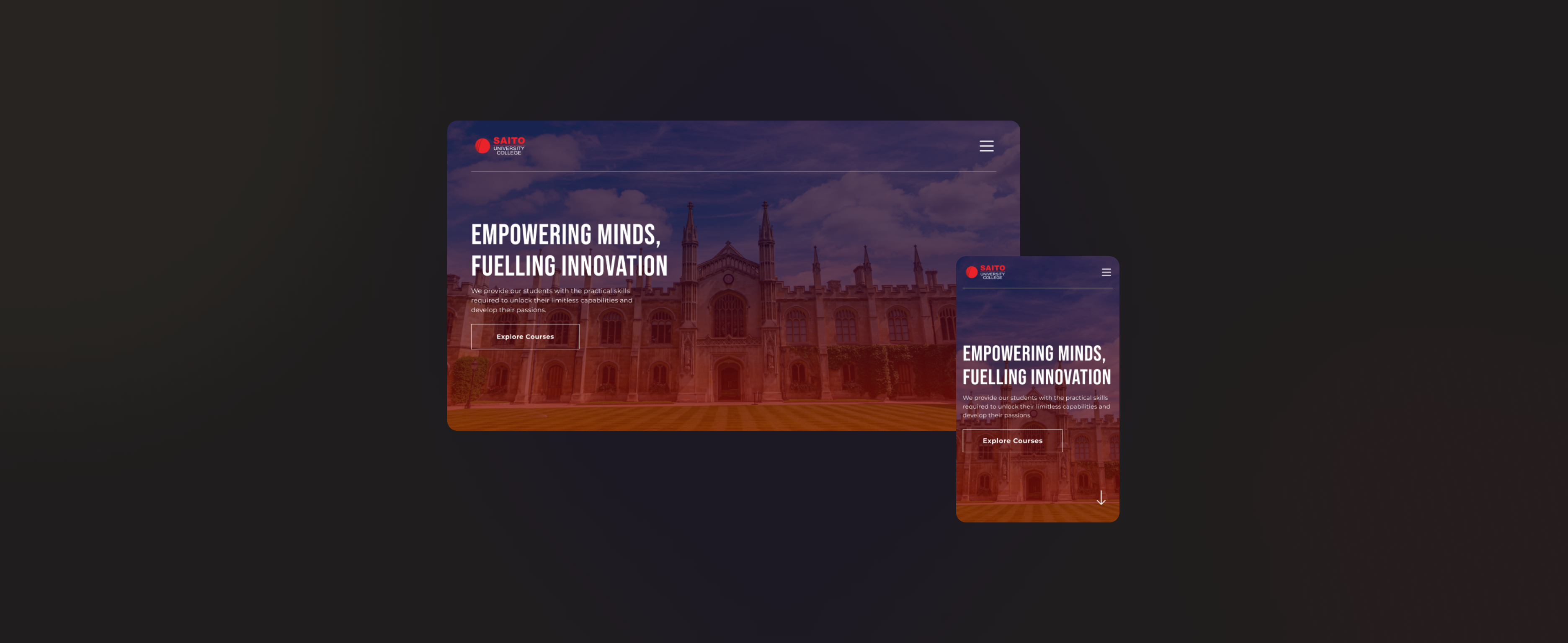
Low fidelity wireframes were created to outline the general user flow and organise the website content. To increase the user's interest towards the university college, a storyline was created for the landing page to make the content more engaging and memorable.


Finalising the designs
Mockups were created after receiving feedback from the stakeholders. The layouts were adjusted to accomodate technical challenges and accomodate actual page content. Cards that grouped courses by areas of interest were added to enhance the storyline, and assist prospective students in deciding the courses that they are interested in.


The impact
The finalised designs were handed over for development, resulting in a website rebuild that significantly enhanced the user journey and improved user access to information.
Key takeaway: Reduce cognitive overload with progressive reveal
For content-heavy websites primarily attracting new users, grouping and progressively revealing information should be essential techniques. A more in-depth user testing and audit is required to determine areas that may overwhelm the user.