Reduce driver onboarding dropoffs with guided, self-paced steps
Overhauled Grab's driver onboarding experience to reduce abandonment and accelerate driver approval. A guided, self-paced flow with progress cues and upfront checks moves drivers from sign-up to go-live faster.
Project year
2025
My role
•
Partnered with client stakeholders to surface pain points and align on goals.
•
Translated insights into mid-fidelity user flows and mockups that targeted key drop-offs.
•
Presented the solution to non-technical stakeholders, clearly explaining the rationale, trade-offs, and expected impact.
The current experience
Despite strong initial sign-ups, we see a steep post-signup drop-off. Many potential driver-partners then turn to customer service and training centers for help—a sign that the current linear, one-size-fits-all flow and unclear requirements create friction, inflate support burden, and slow time to activation.
With driver competition intensifying, the onboarding experience can become a key differentiator to improve sign ups
Drivers know exactly what ’s required, complete their application without confusion, and track their progress online — getting on the road faster with Grab.
The core redesign principles
Organise content logically to create a clear path to completion.
Communicate requirements and set expectations upfront.
Make content and interaction easy to understand and leave no room for ambiguity.
Provide timely, helpful guidance throughout the process.
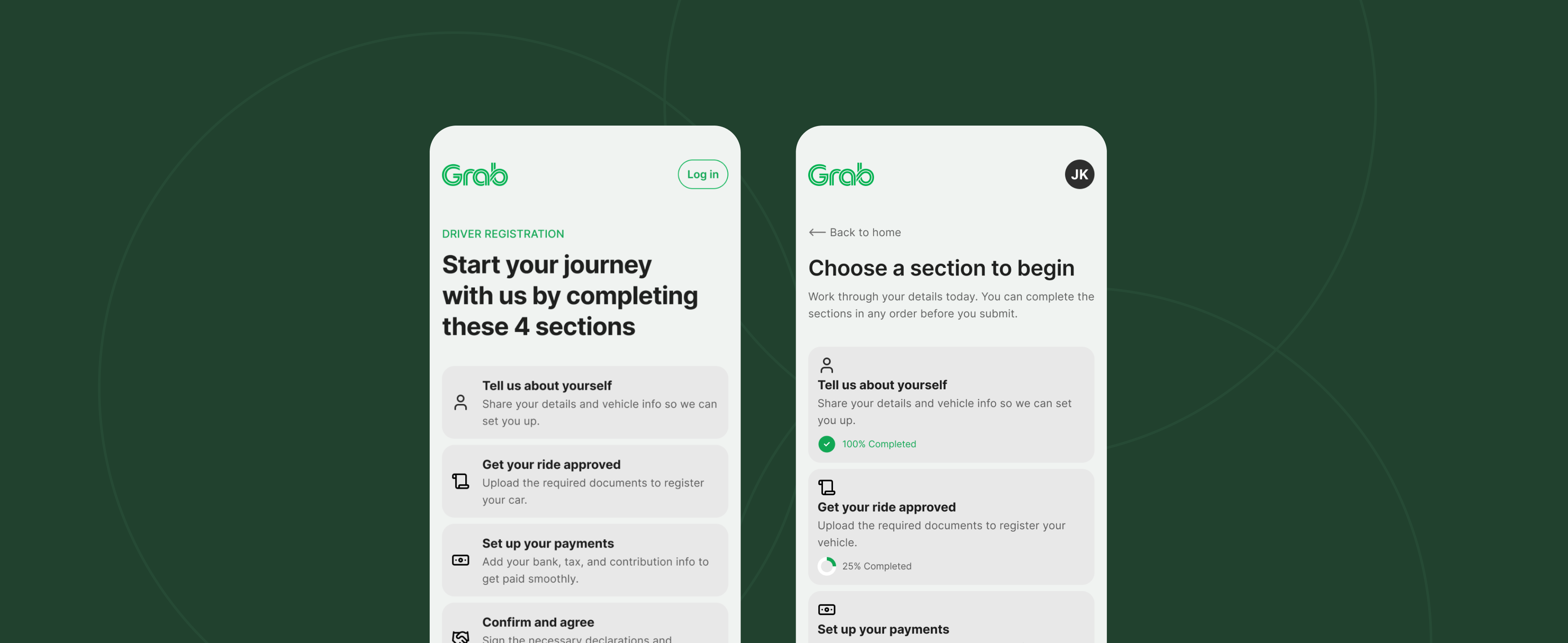
Turning linear steps into a simple post-signup main menu
The flow was restructured so that after sign-up, users land on a main menu. All tasks are grouped into four themed sections, reducing perceived complexity, clarifying next steps, and helping potential drivers progress faster.

Setting the user's expectation
The landing page aims to set clear expectations from the first tap—what the journey includes, roughly how long it takes, and what to prepare—so users feel in control and confident to begin. By removing unknowns and showing a simple path, we lower anxiety and hesitation, increase completion, and reduce avoidable support.

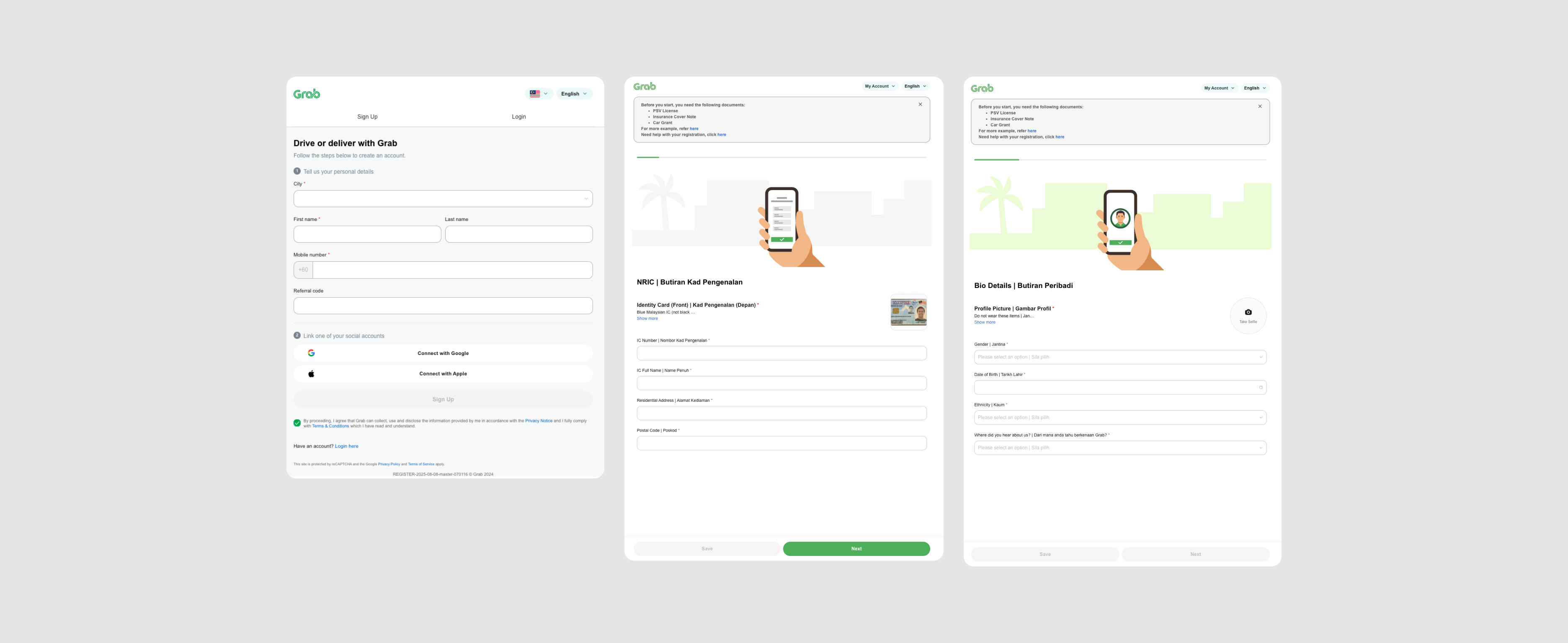
Removing potential blockers to boost completion
The sign up screen is immediately followed by a light pre-check that previews the required documents and makes clear that users can continue without them. This transparency lowers anxiety, preserves momentum, and turns more starts into finishes.

Speeding up completion with self-paced sections
A clear section overview in the main menu shows what each part includes and current progress. Self-paced, any-order completion removes blockers and fits around real-life interruptions, increasing the rate of finished submissions.

Motivating users intermittently
Throughout the various form sections, a progress-focused checklist is used to break the journey into small wins, and pair it with a concise highlight of a Grab driver benefits as a positive nudge. Together, these cues motivate users to keep going and reduce drop-offs.

A video recording of the mockup
How to measure success?
Track each stage of the onboarding process to identify and fix drop-off points, increasing the number of drivers who complete activation and start earning.
Use completion data to continuously improve the onboarding flow, ensuring every UX decision drives higher driver activation rates.
Reducing repetitive onboarding queries through better UX, we'll decrease support ticket volume and free up customer service teams to focus on high-value interactions.
What are the next steps?
Conduct a technical session to understand the current setup and system requirements, then build a proof-of-concept and measure it against baseline metrics to validate the design before scaling.