Researching and designing a mobile application for a local florist
Bloomtastic is a mobile app to discover and buy fresh flower arrangements from your local florist, offering personalised recommendations for a special someone or any occasion.
Project year
2021
My role
•
Conducted user research to determine user pain points and usability tests to ensure that they have been addressed.
•
Designed wireframes, mockups and prototypes to address user pain points.
The challenge
Busy professionals and budget-conscious students often struggle to find the perfect flowers. Professionals lack time to research unique arrangements and recommendations, while students need transparent pricing to stay within their budget. Both demographics crave a convenient way to surprise loved ones with beautiful flowers.
User personas were created to emphatise with the users and guide the design process.
These personas were crafted around the common pain points identified from the initial user interviews.


User journeys were mapped out for each persona to outline the steps taken to reach their goal.
Common user behaviours identified from the user research process were included into the table to anticipate possible scenarios when using the app.

Visualising the user interaction
Storyboards were created to better visualise the interaction process and uncover gaps in the thought processes before wireframing began.

Drafting the main user flow on paper helped to rapidly test out different ideas.
This ensured that all the important elements were included to well address user pain points. Elements that were found to be most intuitive in each iteration were picked and combined into a refined paper wireframe.

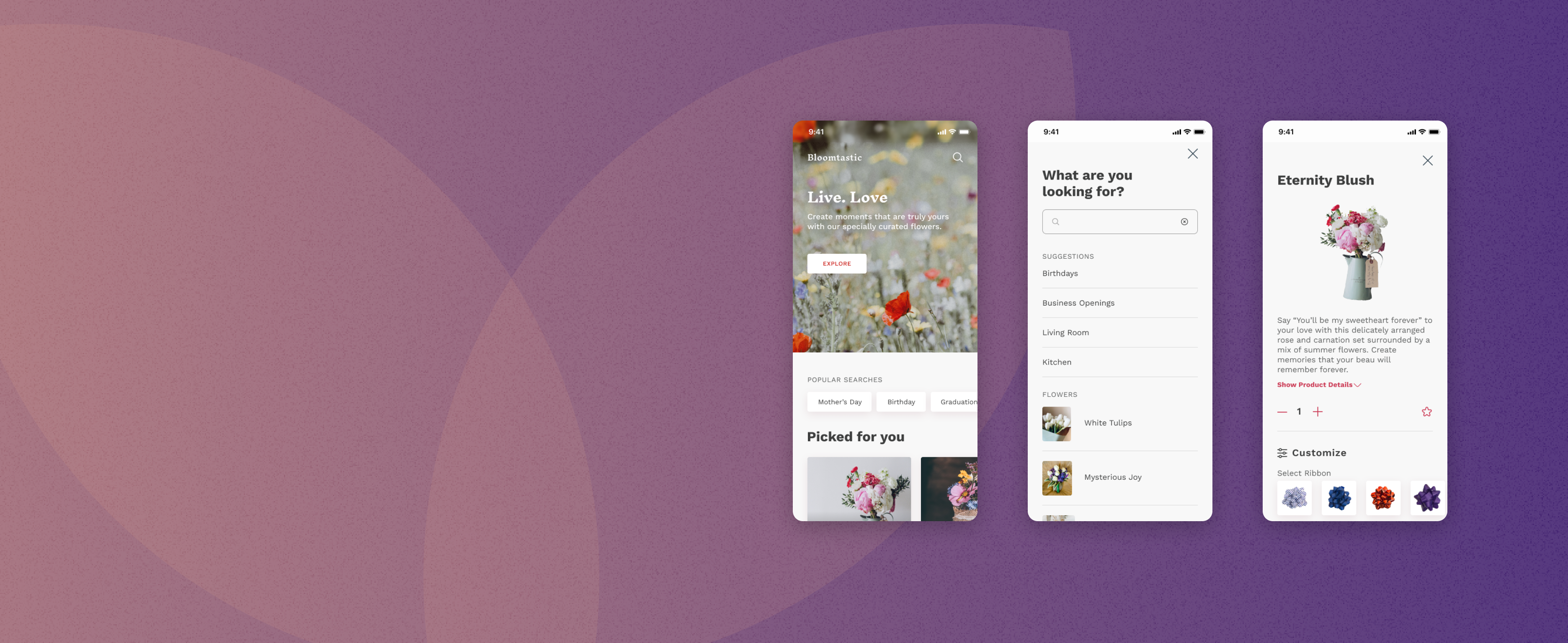
Paper wireframes were converted to digital ones and prototyped.
Missing elements and screens were added to complete the user flow. The wireframes were then connected, becoming a prototype for a user flow test.

A moderated usability study
The study involved 5 participants, each completing a 15-minute study to assess and identify key areas for improvement in the user journey.
Users want to be able to accomplish their goal with the least steps possible.
Individuals require affirmation before moving forward with the next step of an ordering process.
Actionable insights were identified to improve the user experience.
A quick search feature was added to streamline the process of finding frequently accessed and popular categories. Additionally, the list of ordered items were relocated to the bottom of the screen, enhancing user convenience by ensuring easy access to their items even while scrolling down the page.


Accessibility considerations
Colours used in texts and action items were ensured to have sufficient contrasts of a minimum of 4.5:1, as set out in the WCAG Guidelines.
Icons were carefully selected and used to accompany texts as a way to provide context for users who are not familiar with the app's default language.
Motions were used to provide a sense of navigation in the main flow. Motion duration was limited to a minimum of 200ms, and not exceeding the recommended 5000ms.
The impact
The new designs were found to meet the end users' needs, bringing convenience when buying flowers. In a new study, most respondents voted that they would use the app again. One user stated: “I have no complaints. Everything is what I expected and is right on point.”
Key takeaway: Different people, different preferences
It is very important to prioritise user feedback. A few more rounds of usability tests should be conducted to ensure that the product sufficiently addresses user pain points, and identify new features that could be added for a more inclusive product.